![]() February 20th, 2018
February 20th, 2018
![]() 80 comments
80 comments
We earn a commission for products purchased through some links in this article.
Brand New Doctor Who Logo
![]()
Thirteenth Doctor Jodie Whittaker today teased the new series of Doctor Who by unveiling a new logo and insignia for the brand to over 700 of the world’s top TV buyers and international press at BBC Worldwide’s annual showcase event in Liverpool. In an evening devoted to the new incarnation of Doctor Who, Whittaker built excitement in anticipation of the new era of The Doctor, leaving global broadcasters in no doubt as to the sense of wonder, joy and mystery the forthcoming series promises audiences.
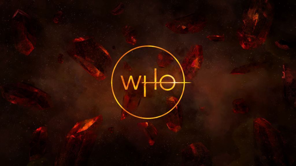
The Doctor Who logo is an iconic and powerful trademark for the franchise that is recognised all around the world. The updated logo and insignia mark a new era of WHO. BBC Worldwide commissioned creative agency Little Hawk to create the brand new designs, working closely with Showrunner Chris Chibnall and Executive Producer Matt Strevens.
BBC Worldwide Executive Creative Director, Rafaela Perera says: “The Doctor Who logo and insignia are the quintessential signifier for the brand. Our aim was to create modern and elegant designs that were anchored in the things that we love most about Doctor Who.”
The sound for the animated logo is created by Matthew Herbert. It will launch with a 10 second animation which features the TARDIS blazing a trail through the logo. All official Doctor Who merchandise featuring the new logo will be available at selected retailers from 20th February 2018.
Doctor Who is a BBC Studios production for BBC One and a BBC America co-production. BBC Worldwide are the international distributors for Doctor Who.
![]()


 Facebook
 Twitter
 Pinterest
 Merchandise
 Flickr
 YouTube
nygel Harrot
February 22nd, 2018 - 2:49pmDo you all think that the reason we have, as fans and viewers, been split into two camps over the ‘feel’ of Dr.Who is that…
…the BBC didn’t have the confidence to create a NEW science fiction program that was ‘cool, slick, adult, humourers and cheeky’ for a TOTALLY different audience so they hijacked Dr.WHO and have tried to crowbar this new vision into it.
I know it’s all down to money for the BBC and that they have a ready made market of suckers who will buy anything with a police box on it rather than to create a new market for a new program with new images.
There seems to be in the ‘new who’ an embarrassment of anything to do with tentacled monsters, quarry planets and family storytelling.
It is ironic that with all these whizzo special effects now a days that the Doctor only seems to visit Earth! (Or on the rare occasions it’s an alien planet then they stay inside!)
The old Who may not have had the money… but we didn’t half get to run around (in camera long shot!) on some fantastic quarry planets and have FUN and ADVENTURE.
nygel Harrot
February 22nd, 2018 - 2:47pmDo you all think that the reason we have, as fans and viewers, been split into two camps over the ‘feel’ of Dr.Who is that…
…the BBC didn’t have the confidence to create a NEW science fiction program that was ‘cool, slick, adult, humourers and cheeky’ for a TOTALLY different audience so they hijacked Dr.WHO and have tried to crowbar this new vision into it.
I know it’s all down to money for the BBC and that they have a ready made market of suckers who will buy anything with a police box on it rather than to create a new market for a new program with new images.
There seems to be in the ‘new who’ an embarrassment of anything to do with tentacled monsters, quarry planets and family storytelling.
It is ironic that with all these whizzo special effects now a days that the Doctor only seems to visit Earth! (Or on the rare occasions it’s an alien planet then they stay inside!)
The old Who may not have had the money… but we didn’t half get to run around (in camera long shot!) on some fantastic quarry planets and have FUN and ADVENTURE.
nygel Harrot
February 21st, 2018 - 10:04pmBBC Worldwide Executive Creative Director, Rafaela Perera says: “The Doctor Who logo and insignia are the quintessential signifier for the brand. Our aim was to create modern and elegant designs that were anchored in the things that we love most about Doctor Who.”
That says it ALL ladies and gentlemen. Forget plots, story, warmth and heart… lets just sell the brand.
(We never had this much hype in the old days)
(Didn’t need it!)
Anonymous
February 21st, 2018 - 10:11pmTimes have changed, chibnalls writing in series 11 could be brilliant (see what i did there) but it will be all for nothing if the BBC can’t get the shows publicity up and so they need to drum up the hype so as many people as possible will hear of the shows revamped style, hopefully attracting back any fans lost from tennant/smith eras.
Lorraine
February 21st, 2018 - 10:44pmI know Nygel but I have to hope there is a future to the programme. Have been so down after the July announcement that feel we have to look forward. I still hate her stupid outfit and have a multitude of other quite deep set concerns. The BBC is very badly run and their world is full of hype and brand sadly. Only the fans will decide how they feel after the new series breaks and let us hope the writers enhance the soul of the Doctor or Who and that the sales side just do that – sell.
Obsie
February 22nd, 2018 - 10:04amI agree, there was a great deal of rhetoric in the release statement, which happens with most things. However, this is the first time I’ve known it to be virtually shoved down our throats. Since I first watched the show in 1967 I’ve never known such high handed emotive language before the release of a new series. Maybe I’m just being cynical, if so then I stand to be corrected quite willingly but I will watch with a more guarded view.
nygel Harrot
February 22nd, 2018 - 2:03pmWouldn’t it be WONDERFUL if Dr.Who just snook back on telly. 5.30pm every Saturday for a 26 week run
(5×4 parters and one 6 parter at 25 mins an episode)
Just let the stories speak for themselves. I worry because recently the more the hype, the more the BBC have said…
“look look everybody we have a GREAT program look look it’s PURE DRAMA we even tell you what it is at the beginning of each program in case you forget”…
…then the weaker and ‘slicker’ the program has turned out to be!
I know i keep going on about the heart and the warmth of the old Dr.Who but to me THAT’S what Dr.Who means… Not CGI cold slickness and sound bites. It all makes me a tiny bit sad.
The Prydonian
February 21st, 2018 - 7:01pmLogo is ok. Think it will grow on me but god how I hate the costume. The silhouette looks so light weight and twee – skinny naked legs with big boots on. Hardly practical . Really the worst outfit. Worse than Colin’s
T.A
February 21st, 2018 - 7:31pmFrom the leaks of her wearing the costume it does not look good, in my opinion, especially in the ankle area.
Whovian
February 21st, 2018 - 11:01pmAgree
Anonymous
February 22nd, 2018 - 1:05amTo be fair, I feel its kind of inkeeping with the doctors ‘tactic’ of appearing like a wierd bumbling idiot, who no one suspects as being the smartest person in the room, until he/she goes full on doctor and wipes the floor with the bad guys
Obsie
February 22nd, 2018 - 9:50amHaving studied the footwear closer and pondered about it, I really can’t see lots of running down corridors being practical. There is now an image firmly fixed in my mind of very undignified clodhopping and galumphing if a rapid exit is called for.
pats86
February 22nd, 2018 - 3:23pmShe might not stay in them boots the Doctor sometimes has subtle changes, she might put some trainers on later?
Adam
February 21st, 2018 - 5:09pmIt just keeps getting better….not!
Lorraine
February 21st, 2018 - 2:48pmActually….am…..a…bit……EXCITED
Pusher
February 21st, 2018 - 3:00pmAt least we don’t have to put up with that awful high pitched racket of an opening credits any more
NickC
February 21st, 2018 - 9:18amWhat I’m not so keen on is the fact that the BBC went to an external agency to get it done. I’m not going to harp on about licence payers money, but there are staff fully qualified to do that within the BBC. And you don’t just pick an agency from thin air – my guess, yes, just a guess, is that as with any external design brief, you ask more than one company to pitch… Not seen it in its proper context yet, but while I agree with it’s “cleanliness” and “sophistication”, it is bordering on bland. Still, it’s how it is used that will count, so I am prepared to eat my words in October.
The Doctor Who logo is dead; long live the Doctor Who logo 🙂
Floppy Who
February 21st, 2018 - 8:40pmThe BBC is a public body covered by the Public Contracts Regulations 2015, so will have almost certainly had to follow a public competitive tendering exercise to select an agency on a best value for money basis. I might just have a look at a couple of tendering portals to see if I can track down the details…..
mjh197
February 22nd, 2018 - 1:42pmthe agency that did the redesign also did the bbc worldwide brand design so they didnt come from no where
The Surgeon
February 21st, 2018 - 9:06amI absolutely love it! So new and clean
pats86
February 22nd, 2018 - 3:20pmDo you think those will be the Doctor’s first words when she gets back into the TARDIS?
Anonymous
February 21st, 2018 - 9:05amI Like the colours of the new logo they remind me of the 9th and tenth doctors era sort of like a star going supernova which is perfect as that’s how Rassilon and Omega discovered time travel. The straight line going through especially on the O makes me think of the minute hand on the clock.
Fiona Ting
February 21st, 2018 - 8:52amI think the new Doctor Who Logo is better than old Doctor Who and different for future
and I sure all the Doctor Who agree with the new Doctor Who logo
Exterminator
February 21st, 2018 - 1:55amIt looks a bit like the Merlin logo.
Haza14
February 21st, 2018 - 1:09amI’m not sure on the “Who” insignia. The DW one eventually grew on me though so we’ll see.
However, I’m loving the new logo! Genuinely first class! My excitement for this new era continues to grow and grow!!
The Outcast
February 20th, 2018 - 11:42pmIts certainly different. I don’t know how to feel yet.
The Drums The Never Ending Drum Beat
February 20th, 2018 - 11:09pmIt’s not a bad logo but it isn’t my favourite either but will wait to see it in the opening theme it could make it better
Anonymous
February 20th, 2018 - 10:15pmAm i the only one getting Sarah Jane Adventures vibes of the ‘who’ part of the logo with the circle round it. Looks like the ‘SJA’ circular logo.
Anonymous
February 21st, 2018 - 10:08pmWould be quite fitting actually as up to this point ‘The Sarah Jane Adventures’ is probs the closest thing to a female doctor we’ve been given, TV wise atleast…
The Doctor Will See You Now
February 20th, 2018 - 10:05pmOh my gosh I’ve just realised something else. The streak through the O transforms the H and O into the female gender symbol! Just look at it from a 90 degree angle and you will see what I’m talking about!
Zgeist
February 21st, 2018 - 4:45amEh, sort of. Not enough for me to think it was intentional.
The Doctor Will See You Now
February 20th, 2018 - 10:00pmWow, that is absolutely gorgeous. I didn’t think anything could beat the Steven Moffat logo, which was easily my favourite, but this might do it!
The horizontal line through the H which continues into the O makes the O look a bit like Saturn, which is a great addition.
Anonymous
February 20th, 2018 - 9:51pmI love it. Its so sleek and classy and streamlined.
Also love the orange-y yellow-y colouring, to me that seems like a call back to the good old RTD era logo, which it immediately reminded me off, and we know that’s the era Chibnall and the BBC are hoping to recapture with this new era…
…So. Freaking. Excited!!!
Adam
February 21st, 2018 - 7:20pmI agree!
R1ch1e
February 20th, 2018 - 9:28pmIt’s really Lovely! Completely new and fresh. I do wish we didnt have to wait so long for it to start though
Judooning
February 20th, 2018 - 9:13pmYou could easily believe someone from the planet Akhaten created this. Has that feel to it with the red rocks and fire like text.
And that theme music is reminiscent of the RTD era one. Which is GREAT!
Master WHO?
February 20th, 2018 - 9:09pmVery Sci-fi and mysterious I must say. Looking at the new picture, am I the only who thinks gypsy/traveller about the 13th Doctor (in a good way obviously)?
whovian
February 20th, 2018 - 9:07pmNew Doctor, New TARDIS, New companions, New logo and a new gravitar profile pic for me
Doctor Stu
February 20th, 2018 - 9:00pmIt looks like something from lord of the rings and I’m not getting the random line rammed through the D. The ‘Who’ one looks like master chefs about to start
prototype dalek
February 20th, 2018 - 8:56pmReminds me of Doctor Strange a bit
Anonymous
February 21st, 2018 - 7:33pmNow you mention it, it does!
Omega63
February 20th, 2018 - 8:42pmVery modern and thin weight to the font. Not really in keeping with what are rather bold fonts of the past. Whether this will be as brand-able and iconic, it’s hard to say.
Although, the lining through the O resembling Saturn is a touch of genius.
Anonymous
February 20th, 2018 - 9:32pmI think you mean Venus
Simon W
February 20th, 2018 - 9:55pmIf u look at the o at a 90 degree angle its the symbol for female. just saying.
Joanne Marqee
February 20th, 2018 - 10:21pmI didn’t even realise that was what it meant but you’ve opened my eyes. Also I really like the colour as all the latest have been more cold colours. This logo seems both more simplistic and more fun.
Anonymous
February 21st, 2018 - 8:29amYes, the Venus sign which is used for the female symbol.
Omega63
February 21st, 2018 - 9:22amI mean Saturn. As in, the planet, with the orbiting rings. Thats what I saw anyway.
When The Doctor Was Me
February 20th, 2018 - 8:37pm“All official Doctor Who merchandise featuring the new logo will be available at selected retailers from 20th February 2018”
OMG! merchandise already!!!!
Anonymous
February 20th, 2018 - 8:49pmWhere do we look for this new merchandise?
prototype dalek
February 20th, 2018 - 8:58pmI think its T shirts for now, from FP to what i have seen
The Temporal Jelly Baby
February 20th, 2018 - 8:32pmI absolutely love it!
When The Doctor Was Me
February 20th, 2018 - 8:28pmLove it! Fresh new look.
The Temporal Jelly Baby
February 20th, 2018 - 8:37pmYes, ‘fresh’ was my immediate reaction too. This makes sense with the fresh new start Chibnall seems to be going with for series 11.
Weeping Angel
February 20th, 2018 - 8:25pmI love it! So glad they didn’t use that fan-made one that everyone seemed to like. I wasn’t a fan of that one to be honest 🙂
T.A
February 20th, 2018 - 8:37pmMe too, I like this one much better.
whovian
February 21st, 2018 - 10:14amPeople are saying the logo is bland, I personally thought that the fan-made hoax logo was bland to be honest. I think the new styled logo fits the 13th Doctor perfectly and I can’t wait for her series to start, although it still feels weird typing the words Doctor and her/she together, but I’m getting used to it.
The Flying Shark
February 20th, 2018 - 8:23pmLove this!