![]() February 20th, 2018
February 20th, 2018
![]() 80 comments
80 comments
We earn a commission for products purchased through some links in this article.
Brand New Doctor Who Logo
![]()
Thirteenth Doctor Jodie Whittaker today teased the new series of Doctor Who by unveiling a new logo and insignia for the brand to over 700 of the world’s top TV buyers and international press at BBC Worldwide’s annual showcase event in Liverpool. In an evening devoted to the new incarnation of Doctor Who, Whittaker built excitement in anticipation of the new era of The Doctor, leaving global broadcasters in no doubt as to the sense of wonder, joy and mystery the forthcoming series promises audiences.
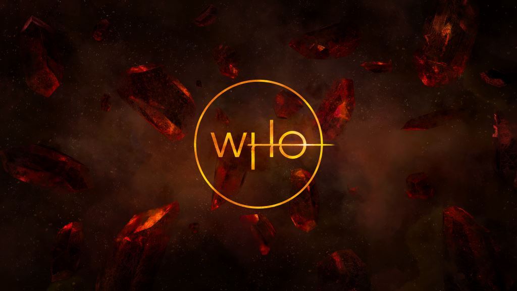
The Doctor Who logo is an iconic and powerful trademark for the franchise that is recognised all around the world. The updated logo and insignia mark a new era of WHO. BBC Worldwide commissioned creative agency Little Hawk to create the brand new designs, working closely with Showrunner Chris Chibnall and Executive Producer Matt Strevens.
BBC Worldwide Executive Creative Director, Rafaela Perera says: “The Doctor Who logo and insignia are the quintessential signifier for the brand. Our aim was to create modern and elegant designs that were anchored in the things that we love most about Doctor Who.”
The sound for the animated logo is created by Matthew Herbert. It will launch with a 10 second animation which features the TARDIS blazing a trail through the logo. All official Doctor Who merchandise featuring the new logo will be available at selected retailers from 20th February 2018.
Doctor Who is a BBC Studios production for BBC One and a BBC America co-production. BBC Worldwide are the international distributors for Doctor Who.
![]()


 Facebook
 Twitter
 Pinterest
 Merchandise
 Flickr
 YouTube
Fiona Ting
February 21st, 2018 - 8:52amI think the new Doctor Who Logo is better than old Doctor Who and different for future
and I sure all the Doctor Who agree with the new Doctor Who logo
Anonymous
February 21st, 2018 - 8:29amYes, the Venus sign which is used for the female symbol.
Zgeist
February 21st, 2018 - 4:45amEh, sort of. Not enough for me to think it was intentional.
Exterminator
February 21st, 2018 - 1:55amIt looks a bit like the Merlin logo.
Haza14
February 21st, 2018 - 1:09amI’m not sure on the “Who” insignia. The DW one eventually grew on me though so we’ll see.
However, I’m loving the new logo! Genuinely first class! My excitement for this new era continues to grow and grow!!
The Outcast
February 20th, 2018 - 11:42pmIts certainly different. I don’t know how to feel yet.
The Drums The Never Ending Drum Beat
February 20th, 2018 - 11:09pmIt’s not a bad logo but it isn’t my favourite either but will wait to see it in the opening theme it could make it better
Joanne Marqee
February 20th, 2018 - 10:21pmI didn’t even realise that was what it meant but you’ve opened my eyes. Also I really like the colour as all the latest have been more cold colours. This logo seems both more simplistic and more fun.
Anonymous
February 20th, 2018 - 10:15pmAm i the only one getting Sarah Jane Adventures vibes of the ‘who’ part of the logo with the circle round it. Looks like the ‘SJA’ circular logo.
The Doctor Will See You Now
February 20th, 2018 - 10:05pmOh my gosh I’ve just realised something else. The streak through the O transforms the H and O into the female gender symbol! Just look at it from a 90 degree angle and you will see what I’m talking about!
The Doctor Will See You Now
February 20th, 2018 - 10:00pmWow, that is absolutely gorgeous. I didn’t think anything could beat the Steven Moffat logo, which was easily my favourite, but this might do it!
The horizontal line through the H which continues into the O makes the O look a bit like Saturn, which is a great addition.
Simon W
February 20th, 2018 - 9:55pmIf u look at the o at a 90 degree angle its the symbol for female. just saying.
Anonymous
February 20th, 2018 - 9:51pmI love it. Its so sleek and classy and streamlined.
Also love the orange-y yellow-y colouring, to me that seems like a call back to the good old RTD era logo, which it immediately reminded me off, and we know that’s the era Chibnall and the BBC are hoping to recapture with this new era…
…So. Freaking. Excited!!!
Anonymous
February 20th, 2018 - 9:32pmI think you mean Venus
R1ch1e
February 20th, 2018 - 9:28pmIt’s really Lovely! Completely new and fresh. I do wish we didnt have to wait so long for it to start though
Judooning
February 20th, 2018 - 9:13pmYou could easily believe someone from the planet Akhaten created this. Has that feel to it with the red rocks and fire like text.
And that theme music is reminiscent of the RTD era one. Which is GREAT!
Master WHO?
February 20th, 2018 - 9:09pmVery Sci-fi and mysterious I must say. Looking at the new picture, am I the only who thinks gypsy/traveller about the 13th Doctor (in a good way obviously)?
whovian
February 20th, 2018 - 9:07pmNew Doctor, New TARDIS, New companions, New logo and a new gravitar profile pic for me
Doctor Stu
February 20th, 2018 - 9:00pmIt looks like something from lord of the rings and I’m not getting the random line rammed through the D. The ‘Who’ one looks like master chefs about to start
prototype dalek
February 20th, 2018 - 8:58pmI think its T shirts for now, from FP to what i have seen
prototype dalek
February 20th, 2018 - 8:56pmReminds me of Doctor Strange a bit
Anonymous
February 20th, 2018 - 8:49pmWhere do we look for this new merchandise?
Omega63
February 20th, 2018 - 8:42pmVery modern and thin weight to the font. Not really in keeping with what are rather bold fonts of the past. Whether this will be as brand-able and iconic, it’s hard to say.
Although, the lining through the O resembling Saturn is a touch of genius.
When The Doctor Was Me
February 20th, 2018 - 8:37pm“All official Doctor Who merchandise featuring the new logo will be available at selected retailers from 20th February 2018”
OMG! merchandise already!!!!
The Temporal Jelly Baby
February 20th, 2018 - 8:37pmYes, ‘fresh’ was my immediate reaction too. This makes sense with the fresh new start Chibnall seems to be going with for series 11.
T.A
February 20th, 2018 - 8:37pmMe too, I like this one much better.
The Temporal Jelly Baby
February 20th, 2018 - 8:32pmI absolutely love it!
When The Doctor Was Me
February 20th, 2018 - 8:28pmLove it! Fresh new look.
Weeping Angel
February 20th, 2018 - 8:25pmI love it! So glad they didn’t use that fan-made one that everyone seemed to like. I wasn’t a fan of that one to be honest 🙂
The Flying Shark
February 20th, 2018 - 8:23pmLove this!